Hello and welcome to this weeks blog post. Today we’re going to discuss a little about visualizing data and the important of it. The importance of data is essential to any organization small or large. However, data in itself is simply bits and bytes. Without the proper aggregation of this data turning it into information, it’s virtually useless. One way to turn data into information is visually. Visualizing data into information is an excellent way to empower yourself and users alike to gain knowledge and wisdom based off factual information.
There are a couple of different Python modules you can utilize for visualizing your data. Below are a few simple examples in which they can be used. To be clear, the information portrayed in these charts are arbitrary.
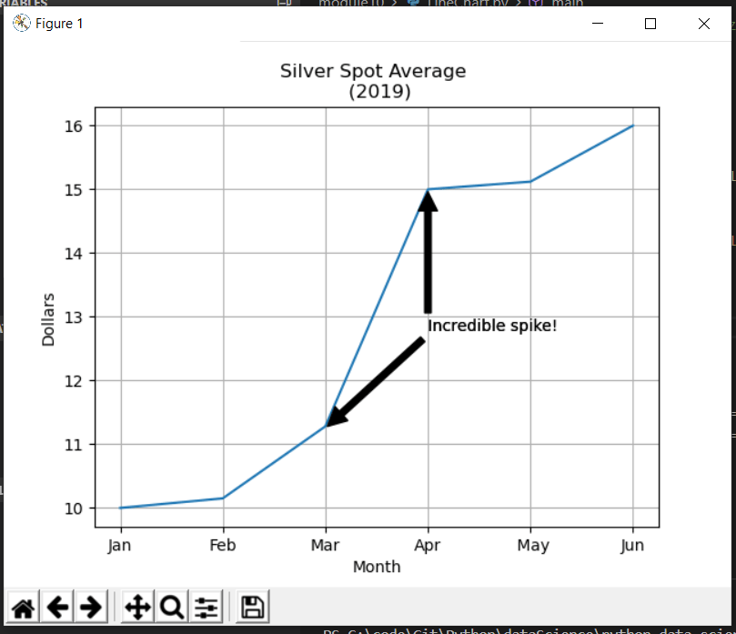
The first example utilizes the matplotlib module and an arbitrary dataset for the last 6 months of silver spot prices in 2019. As you can see the X axis contains the months and Y axis the dollar amount. Additionally, I’ve included the grid and a simple annotation indicating an incredible spike in one month.
The code:

The chart created from the code:
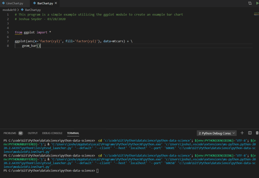
The next module is called ggplot. Unfortunately, I was not able to properly get the chart to display utilizing the ggplot module, and in fact I had to search around on StackOverflow in order to find a hack in order to even get the code to compile after importing the module itself. That being said, since I was not able to get it to work, I simply posted an example from the library documentation.
In short the issue with ggplot revolved around the pandas library. The fixed that worked for me was following the StackOverflow post which included the following steps:
1.) Navigate to the path where you installed python.
2.) Navigate to /site-packages/ggplot and locate the utils.py file and modify the existing block:
From:
date_types = ( pd.tslib.Timestamp, pd.DatetimeIndex, pd.Period, pd.PeriodIndex, datetime.datetime, datetime.time)
To:
date_types = ( pd._tslib.Timestamp, pd.DatetimeIndex, pd.Period, pd.PeriodIndex, datetime.datetime, datetime.time)
3.) Navigate to /site-packages/ggplot/stats and locate the smoothers.py file and modify the existing line of code
From:
from pandas.lib timestamps import Timestamp
To:
from pandas._libs.tslibs.timestamps import Timestamp
The code taken from the documentation from ggplot:
That wraps up this weeks blog posting. For the example code please feel free to visit on Github: https://github.com/joshsnyder/python-data-science/tree/develop/module10
